10 Dental Website Design Trends for 2026 (With Real Examples)
Your dental website is often the first impression a patient has of your practice. In 2026, patients expect more than a static page with your phone number — they want an experience that builds trust instantly.
We analyzed hundreds of dental websites and identified the 10 design trends that are driving the most patient conversions right now. Each trend includes a real example you can explore.
The 10 Trends
1 Dark Premium Themes
The dental industry has been stuck in "clinical white and blue" for decades. In 2026, premium cosmetic practices are breaking the mold with dark, sophisticated themes that communicate luxury and expertise.
Dark themes work especially well for:
- Cosmetic dentistry practices
- Practices targeting high-income patients
- Clinics offering premium services (veneers, implants, smile makeovers)
The key is contrast — gold, cream, or purple accents against a dark background create a feeling of exclusivity that patients associate with quality care.
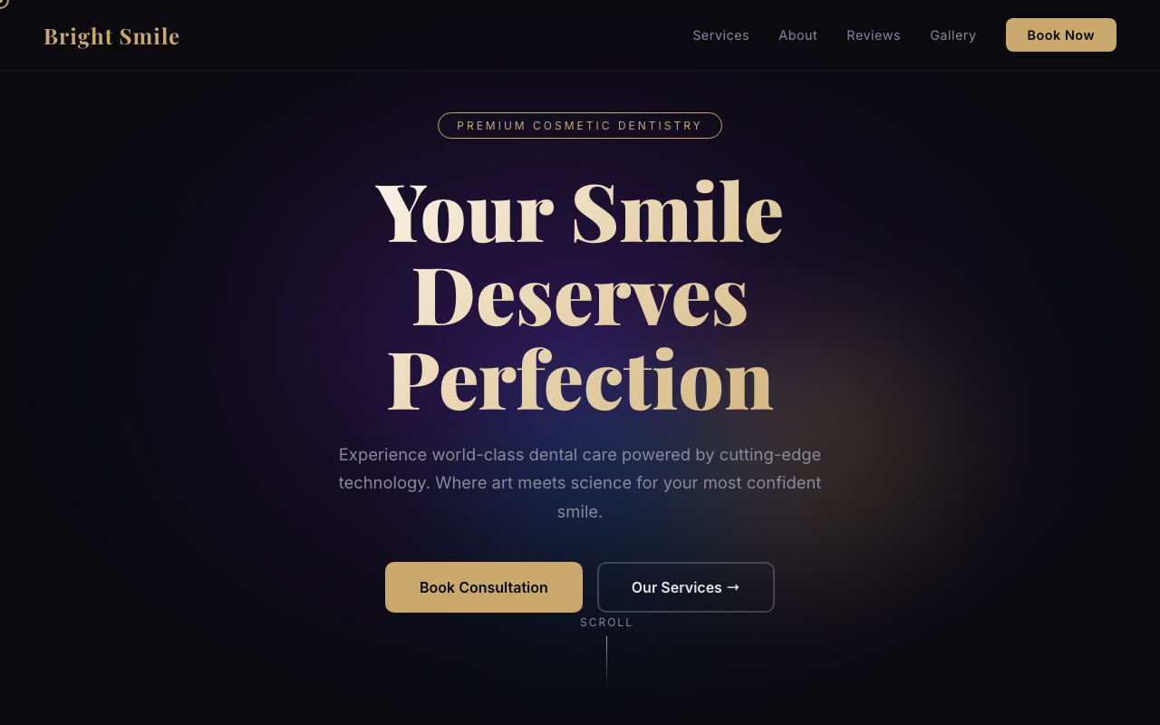
Example: Bright Smile Dental
Dark theme with gold accents, particle background, 3D card effects, and animated gradient orbs. Communicates premium cosmetic dentistry.
View live demo →2 3D Interactive Elements
Static websites feel outdated in 2026. Modern dental sites use 3D tilt effects on cards that follow the user's cursor, creating a tactile, interactive feeling. When a patient hovers over a service card and it tilts in 3D — it signals "this is a modern, tech-forward practice."
The technology behind this is pure CSS transforms with JavaScript mouse tracking — no heavy 3D libraries needed. It loads fast and works on all devices.
3 Glassmorphism Navigation
The floating glass-effect navigation bar is everywhere in 2026. Instead of a solid header that takes up screen space, a semi-transparent pill-shaped nav floats over the content with a blur effect behind it.
This trend works because:
- More content visible above the fold
- Feels modern and polished
- Works beautifully on both dark and light backgrounds
- The CTA button stands out more against the glass
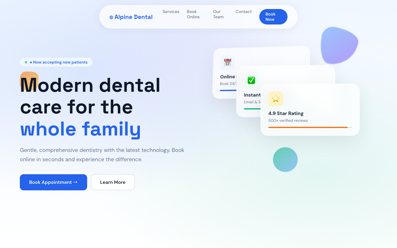
Example: Alpine Family Dentistry
Floating glassmorphism pill nav, 3D card stack in hero, interactive booking widget, and floating geometric shapes.
View live demo →4 Animated Hero Sections
The hero section is your 3-second chance to make an impression. In 2026, top dental websites are replacing static hero images with:
- Animated gradient orbs — smooth, colorful backgrounds that move organically
- Particle systems — connected dots that create a tech-forward feeling
- Floating 3D shapes — circles, blobs, and geometric elements that drift naturally
- Morphing blobs — organic shapes that smoothly transform in the background
These replace stock photos of smiling patients (which patients have learned to ignore) with dynamic, unique visuals that hold attention.
5 Inline Booking Widgets
70% of patients prefer booking online. But in 2026, the best dental sites don't just link to a third-party booking page — they embed the booking experience directly into the website.
The trend is an interactive widget that shows:
- Available time slots as clickable cards
- Service type selector
- Instant confirmation
- No redirects to external platforms
Every click away from your site loses patients. The booking should happen on your site, not on Zocdoc or Doctolib.
6 Bento Grid Layouts
Inspired by Apple's product pages, the bento grid layout is replacing traditional service card grids. Instead of identical cards in a row, services are arranged in varying sizes — wide cards, tall cards, and standard cards — creating visual hierarchy and interest.
Bento grids work especially well for dental services because they let you:
- Highlight your most profitable service with a larger card
- Group related services visually
- Add animated gradient borders on hover for interactivity
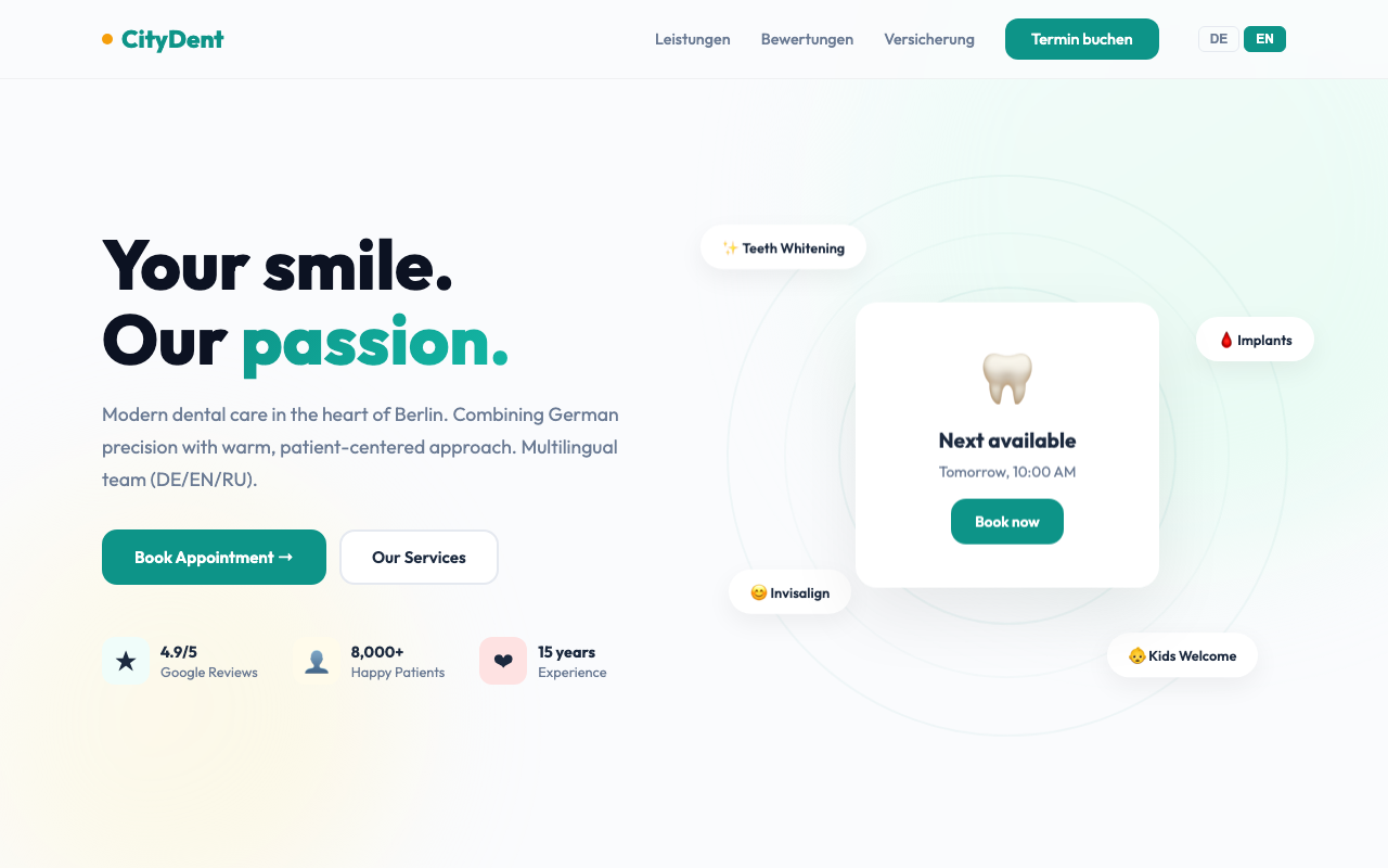
Example: CityDent Clinic Berlin
Bento grid services layout, morphing gradient blobs, floating service pills, masonry review grid, and multilingual support (EN/DE).
View live demo →7 Gradient Morphing Backgrounds
Solid color backgrounds feel flat. In 2026, the trend is organic gradient blobs that slowly morph and shift — changing shape, size, and position over 10-15 second loops.
This creates a living, breathing feel to the page without the performance cost of video backgrounds. Two or three gradient blobs with CSS blur create a calming, professional atmosphere that suits dental practices perfectly.
8 Infinite Review Carousels
Patient reviews are your most powerful conversion tool. The 2026 trend is auto-scrolling horizontal carousels that continuously display reviews — no clicking, no pagination, just a flowing stream of social proof.
Design best practices:
- Show star ratings prominently
- Include patient first name and treatment type
- Auto-scroll at a comfortable reading speed
- Duplicate reviews to create seamless infinite loop
- Pause on hover so users can read
9 Scroll-Triggered Animations
Elements that fade in, slide up, or scale as you scroll create a sense of discovery. In 2026, every modern dental website uses Intersection Observer to trigger entrance animations as content comes into view.
The key is subtlety:
- Translate 20-30px (not 100px)
- Duration 0.5-0.7s (not 2s)
- Stagger child elements by 0.1s for cascade effect
- Trigger once — don't re-animate on scroll up
10 Multilingual by Default
In diverse markets — whether it's the US, Germany, the Netherlands, or Austria — dental practices serve patients who speak multiple languages. The 2026 trend is built-in language switching rather than relying on Google Translate (which butchers medical terminology).
Modern dental sites offer 2-4 languages with:
- One-click language toggle in the navigation
- Properly translated medical terminology
- Language preference saved in localStorage
- SEO benefits from multilingual content
All three of our demo sites above feature professionally translated content — not machine translation.
Summary: What Makes a Great Dental Website in 2026
The best dental websites in 2026 combine:
- Visual impact — dark themes, animations, 3D effects that build trust instantly
- Conversion optimization — inline booking, click-to-call, review carousels that drive appointments
- Technical excellence — fast loading, mobile-first, SEO-optimized, accessible
- Patient-first content — multilingual, clear pricing, easy navigation
If your website was built more than 2 years ago, it's likely missing most of these elements — and losing you patients to competitors who have already adopted them.